The Pollfish Survey Results Dashboard: Understanding its Functionality and How to Use it
You’ll find the results of the survey you launched in the survey results dashboard on Pollfish. This page is your go-to source of survey data once the data of a survey is complete — that is — once all quotas from that survey are retrieved and the questionnaire has been fully filled out.
In order to properly analyze survey data and perform any sort of market analysis, whether macro or micro, you’ll need to have access to a clear and accurate set of survey results data.
Luckily, on Pollfish, the survey results page is easy to access, view and navigate. The data itself is of high quality, given the rigorous checks that the Pollfish platform facilitates to provide quality research data and avoid survey fraud.
This article delves into the ins and outs of the survey results dashboard, the page on the Pollfish online survey platform that contains all the survey results specific to the survey you run.
Understanding the Survey Results Dashboard on Pollfish
This dashboard is a page that contains all the results from the survey you conducted on the Pollfish market research platform, whether you ran the survey via the Distribution Link feature or randomly through our vast network of publishers.
The former method allows you to send surveys to specific people and on the specific digital properties you choose to insert your survey.
The latter refers to our Random Device Engagement (RDE) approach of survey distribution, which is a kind of organic sampling method that deploys the survey across a vast network and targets users where they exist voluntarily.
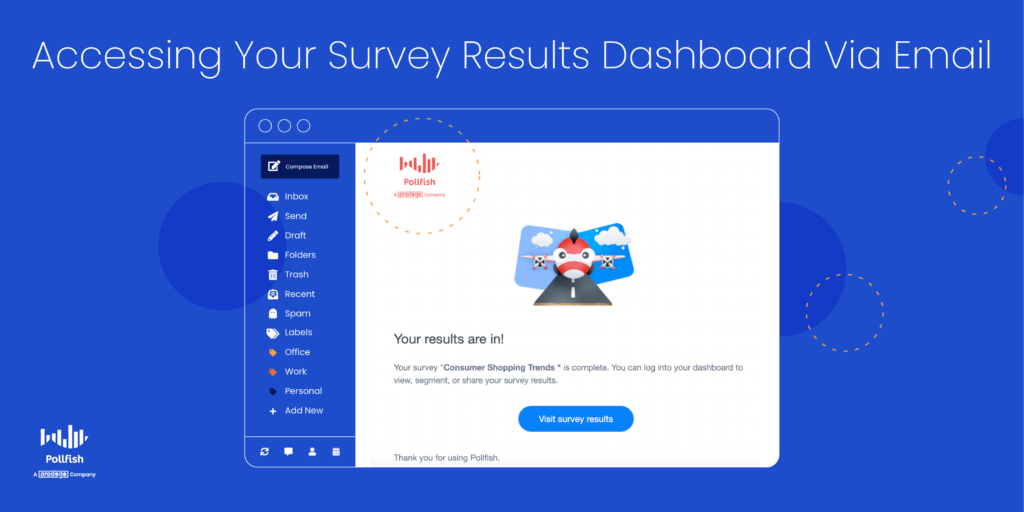
Each survey will have its own results page, meaning that each survey will have its own survey results dashboard. Whenever your survey collects all of its responses, it’ll be rendered complete and you’ll be sent an email prompting you to view your survey results.
Digging into the details of the survey results
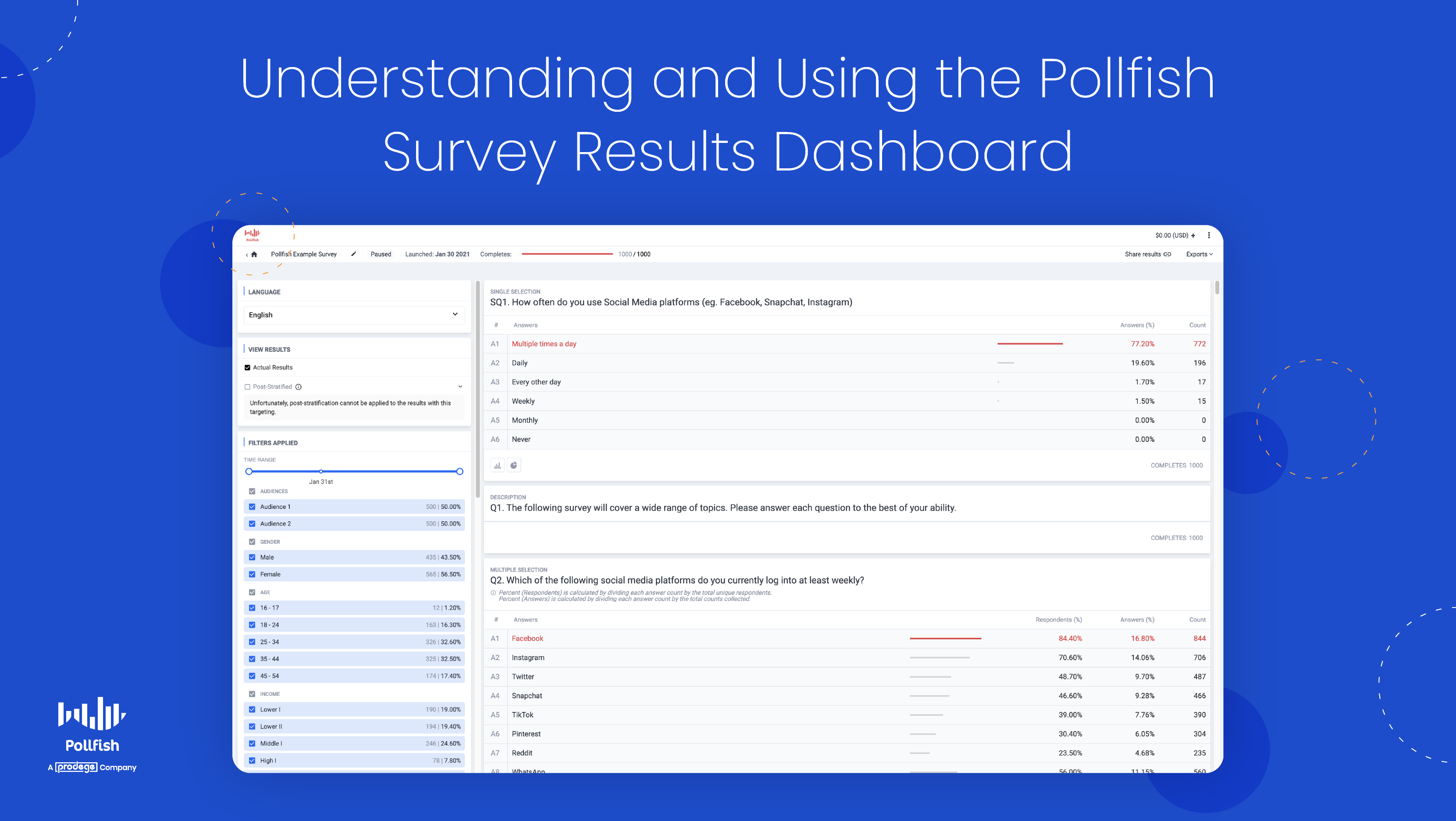
The survey results dashboard displays more than just the statistics of each question you ask. Instead, you’ll find a granular breakdown of both the answers and the audience targeting.
This dashboard contains several options to view your survey results. You can view them in basic table form, which displays the question, the answers and their respective count and percentage of respondents who selected each.
You can also view your results in more visual ways, such as by way of a column chart, filled with colorful bars, or through a pie chart, best suited for visual learners.
The survey results dashboard also provides several export options. These exports present additional ways in which you can view your survey data. Whether you want to download an Excel file with your survey data or analyze your data via Crosstabs, it can all be found on this page (on the upper right corner).
Remember, each such page displays all the data associated with one particular survey. However, there is a way to view all completed surveys in list form. (More on this in the How to Access the Survey Results Dashboard section below).
The Contents of the Survey Results Dashboard
We discussed the major aspects of the survey results page in the previous section. However, there’s more to consider, along with all the specific subcategories that come with the contents of this dashboard.
The following lists all the contents that you can find on the survey results dashboard:
- The launch date and number of completes (on the center top)
- The option to get a sharable link to the survey (on the upper right)
- Exports (on the upper right)


- Excel
- CSV
- Crosstabs
- SPSS
- The survey questions and answers
- The count of each answer & the percentage of respondents who chose it
- The ranking (if it’s a ranking question)
- Answer visualizations (aside from a table view)
- Column chart
- Pie chart
- 2 ways to view results
- Actual results
- Post stratified
- Post-stratification is a weighting method to achieve a distribution equal with that of known characteristics of a population. It can be applied to all supported categories, such as countries, ages, gender and income.
- A robust data filtering system
- Filter the results based on a wide variety of demographic/location/device filters. This allows you to learn how granular segments of the population answered your questions.
- Time range
- View results based on the time they came in
- Screening questions
- See how respondents answered based on their screening question
- Gender
- Filter by gender (male, female, nonbinary)
- Age
- Filter answers based on various age groups
- Location
- Filter results by country, county, state, US census region and more
- Employment status
- Filter answers based on respondents’ employment status
- Any other targeting filters you may have added
- Time range
- Filter the results based on a wide variety of demographic/location/device filters. This allows you to learn how granular segments of the population answered your questions.
- Visualizations based on respondent categories
- View tables, column charts and pie charts on specific categories such as ethnicity, language, marital status, income and other audience demographics.
How to Access the Survey Results Dashboard
There are two ways to access your survey results. We briefly explained the first way in the section on Understanding the Survey Results Dashboard. To reiterate in further detail, once your survey is complete, you will be notified via email.
This email contains a large blue button with the call out to “View survey results.” Simply click on this button and you’ll be taken directly to the survey results dashboard for the completed survey in question.
Here you’ll find all the contents of the dashboard, as laid out in the previous two sections. You can filter the results, view them in any of the supported visualizations and export them in your file of choice.
You can also access the results dashboard by visiting the general dashboard. Just go to https://www.pollfish.com/dashboard/. Here, you’ll get a bird’s eye view of all your projects. All your surveys will appear here in list form, by way of the name of each one.
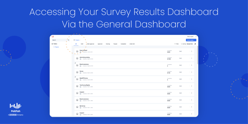
Notice that you’ll find the initials of the surveys’ creator(s) under each survey name. You’ll also see the date each survey was created, its number of completes (expressed as a number out of a preset total: 100/500), along with its status, such as draft or completed.
This page includes upper navigation in which you can view your list of surveys based on their status, for example, drafts, under approval, approved, paused, completed, etc. To view the surveys that have all their results in, click on the “Completed” tab.
This, in turn, will allow you to see a list of surveys that have been completed, meaning they have a survey results dashboard, which you can click on to view all your results data. By clicking one of these completed surveys, you’ll be taken directly to the survey results dashboard, which has all the information you’ll find by accessing it via email.
What You Can Do in the Survey Results Dashboard
By this point, we gathered that you can do five major things on this results page:
- View completed survey data
- Filter the data by demographics, time range, post-stratification and more
- Export the results in different formats
- Share the data through a link
- Quantify answers and draw conclusions
But there’s much more you can do with the survey results dashboard.
First off, you can conduct a survey data analysis and make observations with researchers, analysts and non-researchers and nonanalysts alike. After all, viewing and studying the data across tram members fosters a culture of data democratization.
You can conduct a market segmentation of your customers to categorize them into separate groups. Since your target market contains all the customers most likely to buy from you, it is often too broad to study on its own. Thus, you should segment your customers into smaller groups and personas.
Given that you can filter by demographics and screening questions, you can detect specific groups of customers and search for patterns in their behaviors and specific answers.
If you’d like to segment your customers even further, you can use your results dashboard to create an RFM analysis. An acronym for recency, frequency and monetary value, this kind of research method segments customers via these three customer behaviors.
In turn, market researchers and business owners can identify which customers are regulars, big spenders and which make one-time purchases. This allows you to distinguish between your customers, assign each customer numerical scores based on the three measures and grant an objective analysis of their value to your company.
Additionally, you can use the results dashboard to conduct research on your own organization, performing an internal assessment such as a SWOT analysis.
An acronym for strengths, weaknesses, opportunities and threats, this analysis allows you to identify these four aspects of your company, department or project, ideal for strategic planning and reducing any negative qualities.
It’s easy to do since all questions and answer data are clearly laid out and available to view in different formats.
Moreover, you can use your results dashboard to complete a market trend analysis, an important overview of your industry. Specifically, it is used to analyze trends in a niche market or an industry at large.
A market trend analysis is a method of analysis of past and current market behavior, featuring dominant patterns of a market and its consumers. It relies on examining statistical data and recorded market behavior over a defined period of time.
Your results dashboard is easy to access and view in different visualization, making it easy to compare market trends over a long period of time.
Finally, you can use your survey results dashboard to form a general customer behavior analysis.
This grants you insight into a swath of customer behaviors and their motivations, allowing you to understand how they tick and the reasons behind their purchases. You can delve deeper by studying their preferences among brands, brand loyalty and much more.
All in all, you can partake in numerous market research projects and perform various analyses thanks to the data filtering and visualization options available on the Pollfish results dashboard.
Getting the Most from Your Survey Results
Having access to a robust dashboard of survey results is key to performing a market research campaign and understanding your customers, or any population you seek to study, whether its your employees, students, readers, etc.
The Pollfish online survey platform is keen on optimizing both the respondent and researcher experience. Thus, it is designed to satisfy and ease the use of both parties.
Researchers can leverage a wide pool of insights in their survey results dashboard, which they can view in any way they please, whether it’s by studying the answers of certain demographics or viewing them in specific formats.
You should therefore opt for a platform like Pollfish, which offers artificial intelligence and machine learning to remove low-quality data and offer a broad range of survey and question types.
It also features advanced skip logic to route respondents to relevant follow-up questions based on their previous answers.
As a DIY survey platform, Pollfish puts you in full control of your survey campaign — from targeting, to deployment method, to the questionnaire and how your post-survey data is presented.
With a research platform containing all of these capabilities, you’ll be able to set up research campaigns your way, reap quality data and gauge consumers of any audience via a granular dashboard of survey results.
Discover the robust survey results dashboard on the Pollfish platform, a results page allowing you to view, filter and export survey results as granularly as you wish for a sublime research experience.